Use these paper and pencil activities with your own class data from the Census at School survey.
Note: designed for Grade 9 Ontario
Print version: (DOC, 205kb and PDF, 72kb)
Activity 1: What is the average household size in your school?
- Create a frequency table
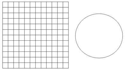
- Create a bar graph and pie chart (circle graph)
- Calculate measures of central tendency
- Extrapolate the school population
Activity 2: What’s our class profile? (done in groups)
- Each group works on a selected variable to:
- Create a frequency table
- Calculate measures of central tendency
- Create different types of graphs
- Describe trends
Activity 3: Is there a relationship here?
a) Is there a correlation between length of forearm and arm span?
- Formulate a hypothesis
- Create a scatter plot
- Draw line of best fit (regression line) and determine its equation
- Steps to draw the line of best fit (discuss in class before doing the activity)
Contributed by Mylène Abi-Zeid, mathematics teacher, Ottawa, Ontario
Activity 1: What is the average household size in your school?
To investigate the average household size, we will use our math class as a sample of the school population. Complete the online Census at Schoolquestionnaire. Use your class results to complete the activity below.
Question: How many people usually live in your household?
| Household Size | Frequency (# of students) |
Cumulative Frequency |
| 2 | ||
| 3 | ||
| 4 | ||
| 5 | ||
| 6 | ||
| 7 | ||
| 8 | ||
| 9 | ||
| 10 |
1. Display the results of the frequency table using a bar graphand a pie chartbelow. Show the percentage calculations for the pie chart under #2.

2. To create the pie chart, calculate the percentagefor each household size (2 person, 3 person, etc.), using the following equation: ![]()
3. We can calculate the number of different household sizes for the student population at our school using extrapolation. Assuming that there are 1,200 students in the school, complete the table below.
| Household Size | Extrapolated number of households |
| 2 | |
| 3 | |
| 4 | |
| 5 | |
| 6 | |
| 7 | |
| 8 | |
| 9 | |
| 10 |
4. Determine the measures of central tendency (mean, median, mode) for our sample.
5. How can we ensure the validityof our calculations and conclusions?
(Do they accurately reflect the population of our school?)
Activity 2: What’s our class profile?
In groups of 3, you will be working with one of the following variables:
- Time spent playing computer games (in hours per week)
- Time spent reading (in hours per week)
- Time spent watching TV (in hours per week)
- Time spent listening to or playing music (in hours per week)
- Time spent doing homework (in hours per week)
- Time spent doing chores (in hours per week)
- Time spent playing sports (in hours per week)
- Time spent with friends (in hours per week)
- Number of days per week when physically active
- Travel time to get to school (in minutes)
Complete the following tasks using your class data collected through the “Census at School”survey. Each group will receive a handout containing the relevant data.
- Organize the data into a frequency table. (You may need to organize the data using intervals.)
- Calculate the measures of central tendency (mean, median, mode). Be sure to include units only in your final answers!
- On graph paper, create graphs for the assigned variable. You must represent your data using:
- a bar graph or histogram
- a circle graph (pie chart)
- a line graph
*Each graph should be on a separate sheet and fill 2/3 of the page. - Describe any trends about the class indicated by your graphs and justify your conclusions. Try to see if a correlation might exist between two variables (for example, between the time spent doing homework and the time spent playing PC games).
Evaluation rubric for Activity 2: What’s our class profile?
|
Categories
|
Level 1
(50 – 59%) |
Level 2
(60 – 69%) |
Level 3
(70 – 79%) |
Level 4
(80 – 100%) |
| Knowledge/ Understanding
Construction of Graphical Model |
sets up data intervals and axes but labels and title are missing or scale is incorrect constructs line, bar and circle graphs with many errors in data
calculates the mean, median, mode with many errors |
sets up data intervals, axes, uses labels but title is missing and scale is inappropriate constructs line, bar and circle graphs with inconsistent accuracy
calculates the mean, median, mode inaccurately |
sets up data intervals, axes, writes title, uses labels and a scale that approaches an ideal constructs line, bar and circle graphs with minor errors in data
calculates the mean, median, mode with minor errors |
sets up data intervals, axes, use labels, write title, and readily chooses an ideal scale constructs line, bar and circle graphs with ease and no errors in data
calculates the mean, median, mode with no errors |
| Communication | needs assistance describing the trend and explaining findings rarely demonstrates correct use of mathematical language, symbols, vocabulary and conventions | describes the trend and explains findings with some accuracy frequently demonstrates correct use of mathematical language, symbols, vocabulary and conventions | correctly describes the trend and clearly explains findings based on the graph most often demonstrates correct use of mathematical language, symbols, vocabulary and conventions | accurately and consistently describes the trend and explains findings clearly consistently uses mathematical language, symbols, vocabulary and conventions correctly and efficiently |
Activity 3: Is there a relationship here?
a) Is there a correlation between length of forearm and arm span?
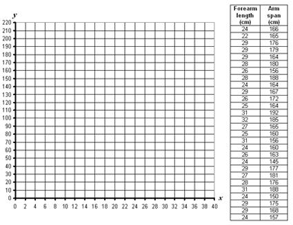
Students in several math classes participated in the Census at School online survey and collected some interesting data about each other. We would like to know if there is a correlation between a student’s right
forearm length (in cm) and arm span (in cm). The table below shows the data gathered through this survey.
Start by formulating the question and hypothesis.
Question: ![]()
Hypothesis:

- Create the scatter plot for this data. Do the data show a trend?
- How would you describe the correlation between
forearm length and arm span? - Draw the line of best fit (regression line).
- Using the regression line, predict the arm span of a student with a
forearm length of 15 cm. - Using the regression line, predict the forearm length of a student with an arm span of 160 cm.
- Will the rest of the students get the same answers as you to questions 4 and 5? Explain.
b) Explore your own question
Finding relationships between two categories of data (or “variables”) helps people make predictions that can inform decisions about important matters (such as setting up a small business or finding the effectiveness of a new medicine).
In this activity, you will look for connections between two of the variables that you collected in the Census at Schoolsurvey. For example, can a person’s foot length be used to estimate his or her height? Is the amount of time that you spend watching TV related to the amount of time that you spend on homework?
1. What question would you like to answer about the relationship between two variables that you have collected? Write this question down and then formulate a hypothesis.The hypothesis is your best guessof what the relationship will be.
Question: ![]()
Hypothesis: ![]()
2. a) Create a scatter plot of the relationship described in question 1. (Use graph paper.)
b) What labels will you use for your variables?
c) On which axis will you place each variable?
Horizontal axis: ![]()
Vertical axis: ![]()
d) What scale will you use for each axis?
Horizontal axis: ![]()
Vertical axis: ![]()
3. a) Does the scatter plot reveal an obvious pattern (e.g. type of correlation shown)?Justify your answer.
b) Do the points seem to describe a straight lineor a curve? Justify your answer.
c) Does the relationship support your hypothesis? If not, create a new hypothesis.Justify your reasoning.
4. a) Draw the “mean” line of best fit on your scatter plot
(See “Steps for drawing the line of best fit” below, as discussed in class.)
b) Explain in detail how you drew the line of best fit.
c) Based on your line of best fit, make a prediction using both
interpolationand extrapolation. Show your answer on the graph.
 5. Using your graphing calculator:
a) Plot your data using the list and stat plot functions of your graphing calculator.
b) Determine the equation of the regression line that would describe this data.
c) Describe and explain differences between your handmade scatter plot and the calculator’s image.
Steps for drawing the line of best fit
1. Calculate the “mean point” by finding the average for each variable.
- add all entries for the variable on the x axis and divide this sum by the number of data
- add all entries for the variable on the y axis and divide this sum by the number of data
2. Plot the mean point on the scatter plot.
3. Draw the line of best fit going through the mean point. Ensure that there is an equal distribution of points above and below the line. The line does not always have to go through the origin (0, 0). Use your common sense to determine when that is the case.
Remember:
The line of best fit must follow the trend. It goes up if the data show a positive correlation. It goes down if the data show a negative correlation.
Evaluation rubric for Activity 3b: Is there a relationship here?
|
Categories
|
50-59%
Level 1 |
60-69%
Level 2 |
70-79%
Level 3 |
80-100%
Level 4 |
| Knowledge/ Understanding | sets up axes but labels and title are missing or scale is incorrect line of best fit was drawn without finding the mean point | sets up axes, uses labels but title is missing or scale is inappropriate line of best fit is inaccurate (mean point is incorrect) | sets up axes, writes title, uses labels and scale approaching an ideal determines line of best fit accurately, but no equation | sets up axes, uses labels, writes title, and readily chooses an ideal scale determines line of best fit accurately and its equation |
| Thinking, inquiry and problem-solving
analyzing data and making inferences and conclusions |
formulates an incorrect hypothesis does not make predictions based on the line of best fit has difficulty recognizing the relationship | formulates a hypothesis with limited under-standing has difficulty making predictions based on the line of best fit has limited understanding of the relationship | formulates a correct hypothesis makes predictions based on the line of best fit with minor errors
shows a general understanding of the relationship |
formulates a clear and detailed hypothesis makes predictions correctly based on the line of best fit shows complete under-standing of the relationship |
| Communication:
using mathematical symbols, vocabulary and conventions communicating with clarity |
looking at the whole task
|
|||
| rarely demonstrates correct use of mathematical language, vocabulary and conventions explanations and justifications are partially understandable | frequently demonstrates correct use of mathematical language, vocabulary and conventions explanations and justifications are somewhat understandable | most often demonstrates correct use of mathematical language, vocabulary and conventions explanations and justifications are generally understandable | consistently uses mathe-matical language, vocabulary and conventions correctly and efficientlyexplanations and justifications are thoroughly under-standable | |

