Downloadable versions of this activity are available in the following formats: (RTF format, PDF format)
Preparation
Time required
Allow at least 60 minutes for this lesson. It could take up to three separate sessions, depending on your students and the depth to which you wish to take it.
Students will learn
- how the statistical investigation process works
- that accurate measurement is important
- that the way in which data are collected can affect the results.
Introduction
Talk about Leonardo da Vinci as you pass out copies of the student worksheet.
For more information on Leonardo and his ideas about body proportion, try searching the Internet using the words ‘vitruvian man.’
Student worksheet
Problem
Discuss the question-Is the Vitruvian theory that height is equal to arm span true for Canadian students today?-so that students understand what they are investigating.
Here are some questions to move the discussion along:
- What do we need to know in order to answer this question?
- Where can we find the information that we need?
- What will we do with the information that we collect?
- Who would find this information useful?
(You may wish to record the key points on the board)
Plan
Encourage students to make a prediction then test it using Census at School data.
Data
- Have students select and enter data for 10 students from their class, using Census at School class data.
- Discuss how to choose the sample and why. Suggest either ‘systematic’ or ‘cluster’ methods (see Sampling techniques below). Explain that samples are taken in a particular way to attempt to make an unbiased selection. The way a sample is selected can have an effect on what you see in a graph of that data and in the conclusions drawn from it.
- Work out the ratios of arm span to height and enter them in the table as both
- an unsimplified fraction (e.g., 170/160, not 17/16), and
- as a decimal (e.g., 1.06). (This will allow comparisons with Leonardo’s perfect ratio of 1. Values above 1 (e.g.1.03) mean that arm span is greater than height, and vice-versa for values below 1 (e.g. 0.97).)
Analysis
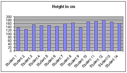
- A row stands for the measurements of one person. When students look at the data table they should notice features like largest or smallest measurements, which columns show most variation, whether height tends to be greater than arm span, etc.
- It is possible that there will be no students who fit Leonardo’s theory exactly. Ask students why this might be.
- A student fits this theory if their height equals their arm span.
- See ‘Mathematical concepts’ below for definitions and information about
- bar graphs
- composite bar graphs
- scatterplots.
- Descriptive words: clump, bump, the same, flat, wide, even, close, spread out, gaps, outlier, clustered, skewed, most frequent, halfway, equal, dispersed, between, ordered, overlapping, line, sample, match.
- They will find that most of the students’ heights are not exactly the same as their arm spans. This is because the students are real and so vary slightly. Some students may also have stretched their arms more than others or stood taller rather than slouched.
Conclusion
Students’ conclusions should relate back to the opening question and explain any difference with their original prediction. They should also mention any features they had noticed or wondered about and investigated.
If all your body measurements were exactly related to each other, you could draw someone from just one measurement. Forensic scientists would know the height and other body measurements of a thief from just one footprint. Fashion designers could also design clothes for you from just one measurement.
The list of statistical terms provided will help students construct a conclusion.
Enrichment activity
The Vitruvian theory contains a total of 10 ratios between different parts of the body.
See a translation of Viturvius’original roman text at <http://penelope.uchicago.edu/Thayer/E/Roman/Texts/Vitruvius/3*.html>
(Vituvius, De architectura, Book III, Chapter 1)
Four of these ratios can be verified using data from Census at School:
- Height is equal to arm span.
- Length from the tip of the elbow to the tip of the middle finger is equal to one fourth of height.
- Length of the hand is one tenth of height.
- Length of the foot is one sixth of height.
Sampling techniques
Systematic sampling: Students choose an individual in the Census at School class dataset as a starting point. Then they select every second or third individual on the list until they have a sample of 10.
Cluster sampling: Students choose an individual in the Census at School class dataset as a starting point. Then they select the next 9 individuals to form their sample of 10.
Simple random sample: Students number the individuals in the Census at School class dataset from 1 to n (number of individuals in the dataset). Then they use the random number generator on a scientific calculator to select their sample of 10.
Mathematical concepts
Ratio:The relation between two values. (For example, the ratio of 8 to 5 can be written 8:5 or 8/5.)
For this particular activity, students should write the ratio as a fraction. DO NOT let students simplify the fraction (e.g., 170/160 reduced to 17/16 will affect the axis scale). Students should also represent the ratio of arm span to height as a decimal value (170/160 = 1.06) to show how it compares with Leonardo’s perfect proportion (170/170 = 1).
Variable: A characteristic being measured. The two variables in this activity are ‘arm span’ and ‘height.’
Bivariate:Analysis involving two variables. This activity is bivariate as it measures two variables for each individual (height and arm span).
Bar graph: Used for discrete (countable) data for a single variable for each individual. Each bar represents an individual and there are spaces between the bars.
Composite bar graph:Used for discrete (countable) bivariate data for each individual. The two bars representing the variables for each individual are touching and there are spaces between these double bars. The same data could also be presented in a scatterplot, but a composite bar graph is a better starting point for students who have not previously worked with bivariate data.

Scatterplot: Two variables are plotted against each other, one on each axis (e.g., ‘arm span’ on the y-axis and ‘height’ on the x-axis). Each individual is represented as a point on the graph. The data could also be graphed using a composite bar graph.
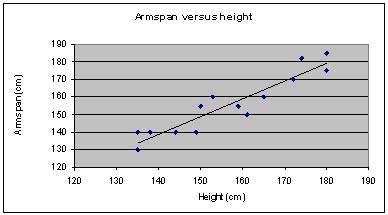
Line of best fit: A line drawn through the data on a scatterplot, where approximately half the points are above the line and half below. Higher-level students could discuss aspects of the gradients and their meanings, such as positive and negative relationships.
Units: The measure used for the variable(s). In this activity, centimetres are used rather than metres in order to avoid awkward decimals.
‘Bumps,’ ‘clumps,’ etc.: Words such as ‘bumps’ (for bar graphs) and ‘clumps’ (for scatterplots) can be used to describe what younger students can see from the graphs.
Outlier: A point in a scatterplot that is a long way from the rest. Outliers can be caused by incorrect measuring.

Range: In a dataset, the largest value minus the smallest value. For example, if the tallest student is 180 cm and the shortest 150 cm, the range is 30 cm. The range can help students select an appropriate scale for the graph.