Downloadable versions of this activity are available in the following formats:
 A good part of our day is spent travelling from one place to another. How much time do we spend travelling to school?
Deciding to walk or take the car may depend on the distance. But after choosing the method of transportation, does everybody spend about the same amount of time to get to school?
Do those who take the bus to school spend less time than those who walk or ride their bicycles?
Does the time it takes to get to school depend on where you live?
To better understand the situation, we will study the “time to get to school” variable. We will then analyze the data based on the method of transportation used. Finally, it will be interesting to see if this situation varies from one region to another in Canada.
Time to get to school
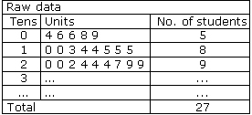
We will enter the class data in a table, grouping them in intervals of ten minutes, for example.
First we write down the numbers as we collect them. Then we put them in ascending order to create a stem and leaf plot, where the tens are the “stems” and the units are the “leaves”.For example, a time of 15 minutes is recorded by adding a “5” to the row in the Units column that corresponds to the “1” in the Tens column.
Time to get to school

Now, let’s try to get an overview.
- Look at all the ordered data. Half the class takes less than how many minutes to get to school? This number is called the median;it’s the central value that divides the list of ordered data into two equal sections.
- What the average time that students in your class spend to get to school?
- Which row contains the most data? What does this mean in your opinion?
- What is the shortest time? What is the longest? What is the difference between them?
- What can you say about the time that students in your class spend to get to school?
To get a better picture of the situation, it would help to add a column to your table that shows the number of students.
Time to get to school
6. Now, can you create a graph that shows how much time the students in your class spend getting to school?
As you can see, everybody does not spend the same amount of time to get to school. We can now examine whether this time changes with the method of transportation.
Time spent by method of transportation
First, group together the students who use the same method of transportation. You can quickly determine the distribution of students by transportation method by creating acircle graph with a spreadsheet program. Your graph might look something like this:

Approximately what fraction of the students in your class walks to school? What are the most popular methods of transportation?
Now, for each method of transportation:
- sort the time spent getting to school, from the shortest to the longest time.
- determine the total time spent, which lets you calculate the average.
- find the number of minutes or less that the fastest half of the students spent. This is the median or the value of the middle item of the ordered data.
- add the minimum and maximum amount of time spent getting to school.
You can create a descriptive table that will look like this:
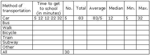
We can now examine the time by method of transportation.
- Do you notice any significant differences?
- Which method of transportation takes the longest?
- Which method of transportation shows the biggest difference between the shortest time (minimum) and the longest time (maximum)? What might explain this?
- Can you describe the overall situation for your class and present your point of view? What type of transportation do you think we should encourage? Under what conditions? Why?
Now, use the data you have to create a graph that properly conveys the information you feel is important.
Comparing your class to a sample of Canadian students
Do you think the situation of your class resembles that of most Canadian students? Obtain a sample of 50 Canadian students at www.censusatschool.ca, under “Data and results”. Then redo the same analysis that you did for your class.
Is the time spent getting to school approximately the same for both groups? If not, how does it vary?
To help you better compare the data, create two tables side-by-side for each group.
Time to get to school

“A picture is worth a thousand words” and can certainly make it easier to read all these numbers. Create appropriate graphs to easily compare the time spent getting to school for both groups.
You can also compare the methods of transportation used.
For each group:
- create a circle graph to illustrate the distribution of students for the different methods of transportation used to get to school;
- use a descriptive table to examine the time spent by method of transportation used.
Do you arrive at the same observations for both groups? Are there any significantdifferences? If yes, what are they? Can you explain the differences taking into account the characteristics of your region?
Create a visual representation that properly illustrates and conveys your main conclusions.
Contributed by France Caron, Université de Montréal and Linda Gattuso, Université du Québec à Montréal.